
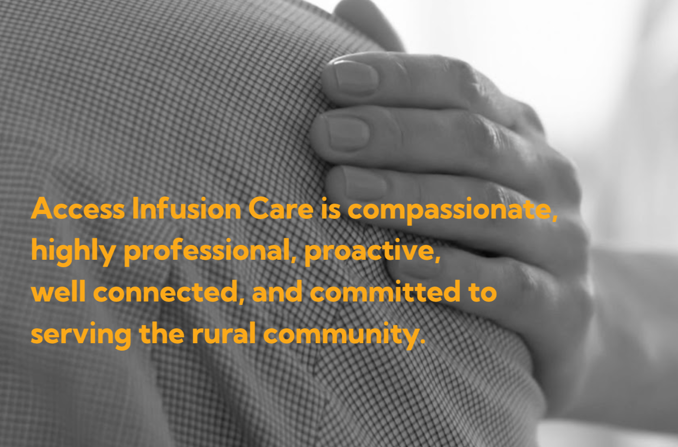
Access Infusion Care
Branding initiative for an infusion services provider dedicated to bringing care closer to rural Americans living with acute and chronic conditions. In collaboration with Dr. Bruce Kutinsky, PharmD and CEO of Access Infusion Care, we developed a brand identity and voice that conveys strength, assurance, and optimism.
Research was at the forefront of this project, aimed at mapping out the brand and messaging strategies of infusion therapy providers across the U.S., including medical centers, specialty clinics, hospitals, associations, and wellness spas. The goal of my brand landscape research was to identify how organizations position themselves, the language they use to reach patients, and the competitive dynamics shaping the infusion care market.
Creative direction & management by Christine Golus.
Final logo design & identity in collaboration with Andy Sikora
See more of the teams work here.
Scope
Brand & Identity
Role
Researcher
Strategist
Brand Identity
Rural residents in the U.S. tend to have less access to healthcare services and are at higher risk for poor health. Treatment for acute and chronic conditions requiring expensive doctor-prescribed specialty infusion therapy is often very far from home.
Background
Audience
patients and caregivers + drug manufacturers + employees + referral sources + insurance companies

A comparative analysis of 15+ infusion providers and related organizations. Each was reviewed for:
Geographic presence
Messaging & taglines
Patient experience positioning
Specialty focus (clinical vs. wellness vs. hospital-based)
Approach
A deep dive using city commission information from one of Michigan’s most rural areas, Lake County. This landscape analysis allows us to better understand rural businesses. Each was reviewed for:
Logo mark design
Color
Patient-Centric Care: Common across independents (Local Infusion, Sage, Uptiv) with language like “making treatment easy” and “care team with you all the way.”
Comfort & Experience: Many brands emphasize a serene, spa-like environment as a differentiator from hospitals (Ameripharma, Uptiv, Sage).
Affordability & Accessibility: Especially visible in Sage Infusion’s “upfront pricing” and “financial assistance” positioning.
Trust & Expertise: Hospitals and larger networks lean heavily on clinical credibility and scale.
Lifestyle Enhancement: Wellness spas expand infusion therapy beyond chronic illness, tapping into the performance/recovery/anti-fatigue market.
Brand landscape: key competitor insights
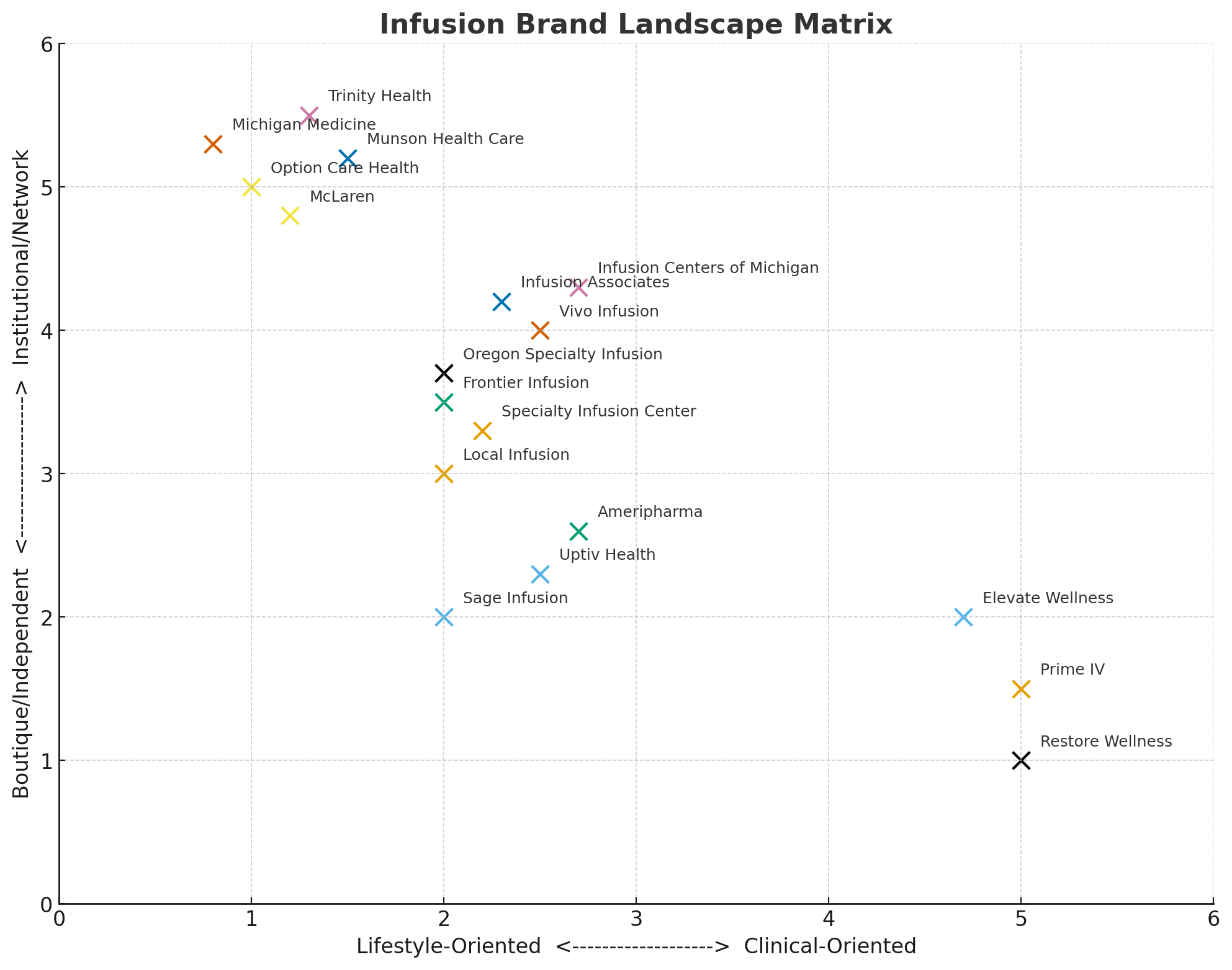
The brand landscape research shows a fragmented but expanding market where experience, convenience, and compassion dominate independent clinic messaging; trust and scale define hospital systems; and wellness narratives drive consumer-focused IV spas.
Where we can differentiate:
Bridging medical & wellness with a unique blend of local credibility & experience
Community connection focus
Positioning as a long-term partner in managing chronic conditions, not just a site of treatment
Results based strategy
Characteristics
local + neighborly + qualified + accessible
Results & Take-away
Access Infusion Care partners closely with leading independent infusion providers to implement a proven growth strategy. By uniting local expertise with their deep experience and shared commitment to excellence, they are building a network that redefines healthcare delivery in the local communities they serve.
Ideating while researching the brand landscape was crucial for developing a visual language that matched the brand identity. Functioning as both designers and strategists, our team was able to use both the data and emotion to create a human-first brand.
Color
Starting from a data-driven selection of colors, our team challenged the expected verses the bold.
The blues were a comfortable favorite in the medical industry, inciting feelings of trust and cleanliness. However, next to competitors, blue blended in.
Exploring purple and greens felt too homeopathic, inciting feelings of nature and whimsy that didn’t fit our target audience.
Becoming human-focused, we imagined a space where patients would want to sit during treatment. Narrowing down our color to something warm and inviting, yet professional.
From here, #FBAA19 was born.
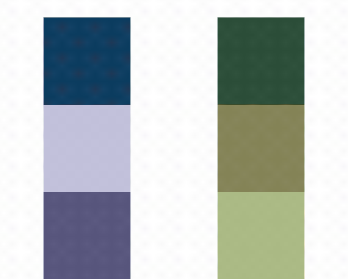

A dark blue-green #11444E is paired with the bold orange, acting as the darker primary color, grounding the overall brand. Incorporating a drift as allows more variation within the brands devices, such as the drop which became an important icon based on the final logo selection.
Approach